Imagine that we call an object and its associated measurements identified by image analysis as a cell. Armed with Panmo's LIPS loop and its array of tools, cell biologists can access these cells and navigate their multitudes of information to directly drive the processes of HCS data analysis in whatever way they deem fit, with quickness and ease. For example, users of Panmo can obtain from a DNA histogram the scan images of the cells represented within the histogram with a simple paint-siphon operation. Conversely, one can paint a subset of cells in a scan image and siphon them out into a scatterplot (or any other plot, for that matter) to visualize the drug effect on certain protein. Everything is done with the swift and responsive mouse, eliminating the need for typing commands and setting restrictive rectangular "gates."
This module works with data generated by Thermo Fisher and PerkinElmer high-content screening instruments.
Major Features
All these HCS-specific features are fully integrated with Panmo's other features to form a synergistic environment, where HCS information flows at your fingertips as you explore your HCS data. Click a feature to collapse or expand the enclosing panel.
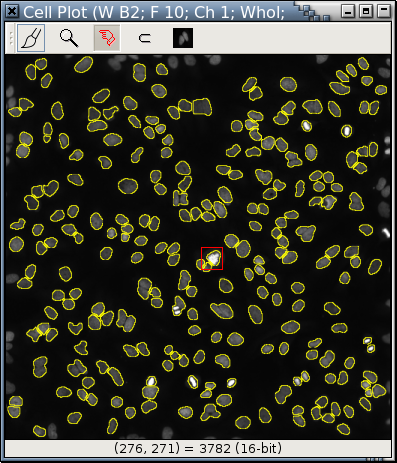
A cell plot is similar to a scatterplot with cell images replacing circles or dots.
All operations applicable to scatterplots can be used over a cell plot. Here, some nuclei are painted red; while the rest are painted blue. There are also operations specific to HCS images (such as adjusting the grayscale or picking a mask.)
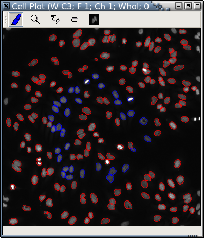 |
| Fig. A: A cell plot |
It is extremely easy to take out the blue "cells" from Fig. A with Panmo's LIPS-Loop and display them in a separate cell plot. Cells in Fig. A and Fig. B are displayed at the same scale.
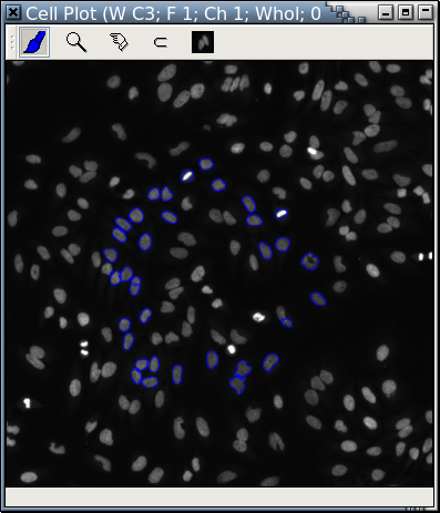 |
| Fig. B: A cell plot of only the blue "cells" in Fig. A |
Blue "cells" in Fig. A are retrieved and displayed in another cell plot at a higher magnification rate that focuses on only part of Fig. A.
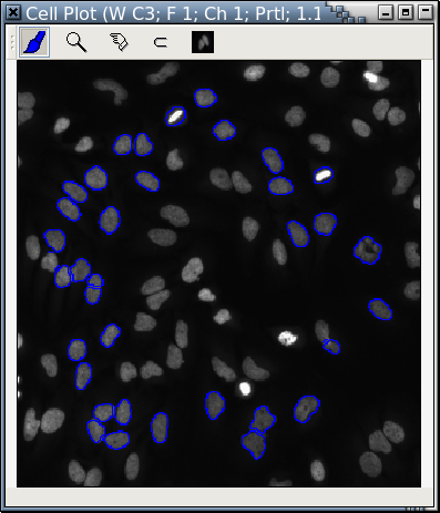 |
| Fig. C: Another cell plot of only the blue "cells" in Fig. A |
With Panmo's extensive plot-trellis drawing capabilities, it's easy to arrange cell plots in a trellis by the plate layout in the original experiment.
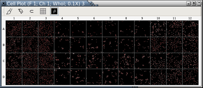 |
| Fig. D: A trellis of cell plots |
Like scatterplots, cell plots support logical zooming, too:
The red rectangle in Fig. E is a logical zoom lens.
 |
| Fig. E |
This is the area within Fig. E's zoom lens, magnified 12.89 times.
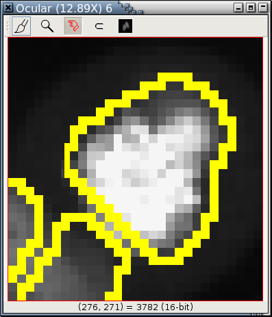 |
| Fig. F |
A plate heat atlas displays a collection of tabbed pages of heatmaps
and tabbed pages of image trellises, as illustrated by the following
animation (if you don't see the animation, you'll have to adjust your
web browser to show the animation.)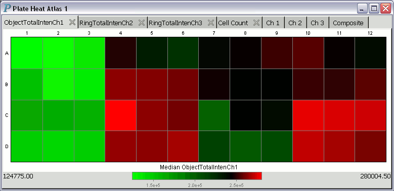
For each heatmap in a heat atlas, the minimum well summary is printed at the lower left corner and is always aligned to the left edge of the plate heat atlas. The maximum well summary is printed at the lower right corner and is likewise always aligned to the right edge of the plate heat atlas.
To get a closer look at the scan image in a panel of an image trellis, you may left-click on it to pop up a window displaying an enlarged version of the scan image. This window also serves as an in situ zooming controller.
When you move the cursor over a heatmap, Panmo will continuously display
information about the well underneath the cursor at the bottom of the plot.
For example, the cursor is over the B3 well in the following plot: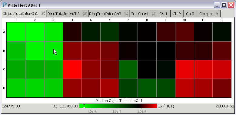
With a few clicks, different colormaps can be used.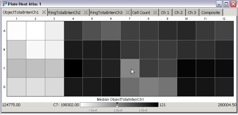
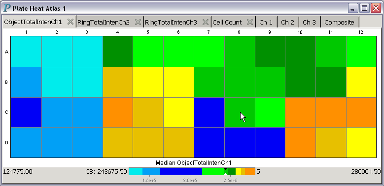
About the colormap used in the above plate heat atlas: This colormap only has 9 colors. The numbers to be encoded by these 9 colors are sorted into ascending order. The smallest third of the numbers are assigned shades of blue, while the middle third of the numbers are assigned shades of green, and the largest third of the numbers are assigned shades of yellow. With this assignment scheme, the median value will always be assigned the color green, which is also the color pointed at by the black-and-while pointer in the color strip at the bottom of the above plate heat atlas.
A plate image atlas is closely related to a plate heat atlas -
it is a plate heat atlas without the heatmaps.
In other words, plate image atlases are atlases of image
trellises only. Panmo has a separate command to
make plate image atlases quickly and directly.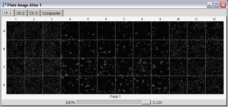
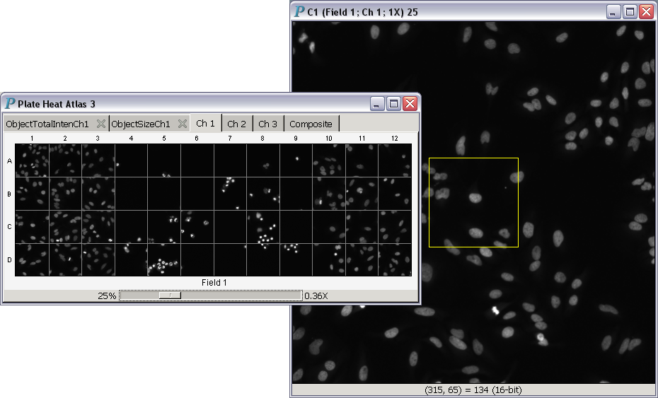
In situ is Latin for "in position." Thus, in situ zooming could be translated into "same position zooming." All images in plate image atlases and plate heat atlases support in situ zooming. Hundreds of images can be zoomed in or out simultaneously with this operation, as illustrated in the following video:
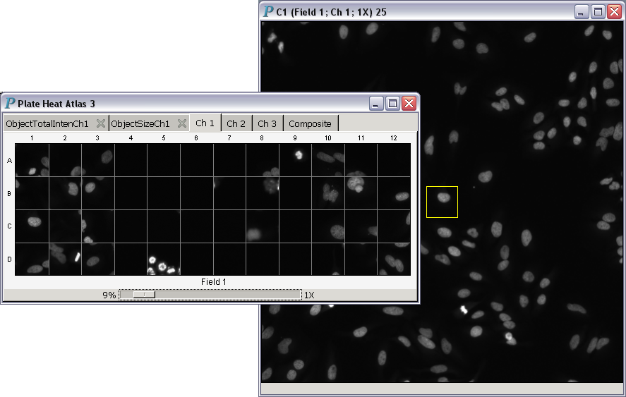
- Magnification power less than 1: The square window to the right displaying a single image is an in situ zooming controller, which was created by clicking on the C1 well in
the plate heat atlas to the left.
The yellow rectangle is the area we zoom into.
All images (be they B&W or composite) in a plate heat/image atlas
zoom into the same yellow rectangle, as if we had clicked on
every well image and placed an identical yellow rectangle in
the same position as the one in well C1. There can be
multiple in situ zooming controllers in simultaneous use
for a single plate heat/image atlas. The yellow rectangle can be
moved around or resized easily with a mouse.
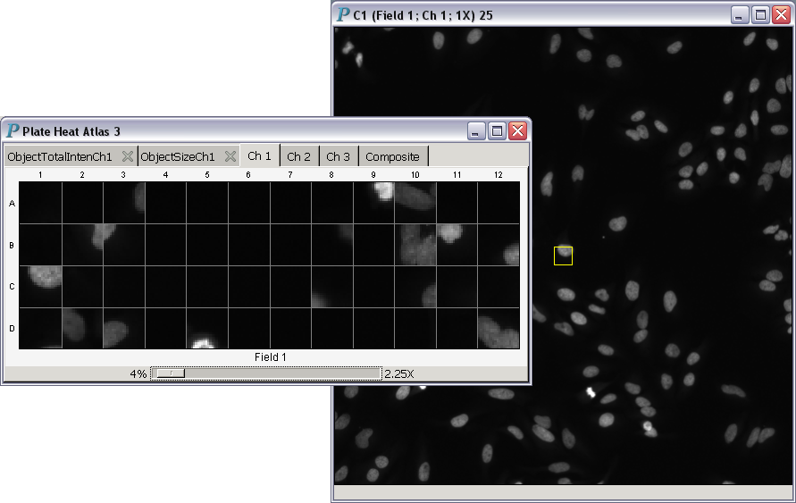
- Magnification power equal to 1:
- Magnification power greater than 1:
This screencast demonstrates in situ zooming with the 64-bit version of Panmo.
A tool for users to prepare publication-quality images selected for interesting features from an HCS experiment. Each image is a rectangular subarea of the original image. All images are magnified to the same extent to be comparable.
Welcome to Panmo's interactive gallery of cells! All images of cells in a cell gallery are displayed using the same scale so that they are comparable to each other. Users can choose the channels to be displayed and whether or not composite images are displayed. The ordering of images can also be determined by a variable (such as a variable measuring DNA content or the response to a particular drug).
A cell gallery example:
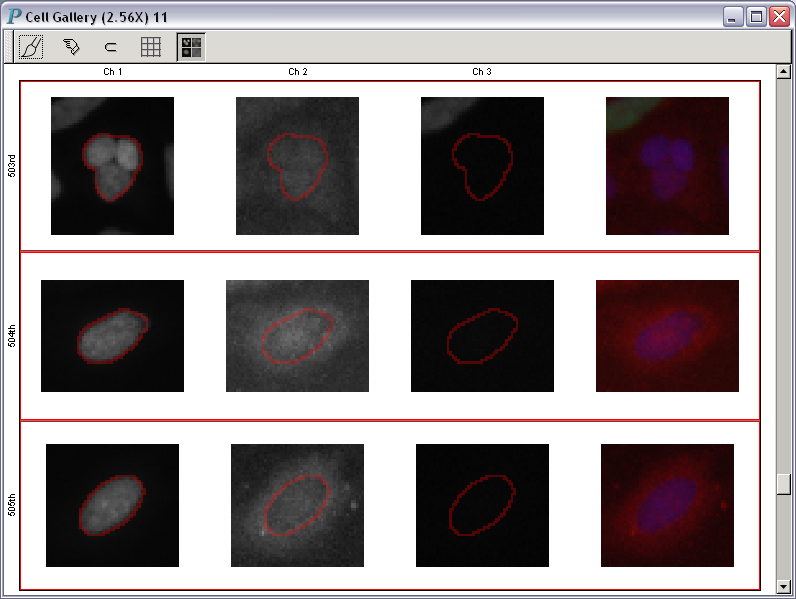 |
| Fig. A |
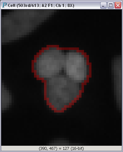
To get a closer look at any one of the images in Fig. A, you just have to click on it:
Panmo can load graphical and numerical data straight from this data store. Please note that if you use a system from a different company, we will be happy to work with you to get Panmo to load directly from your database. Feel free to contact The Chi-Square Works, Inc. for more details.
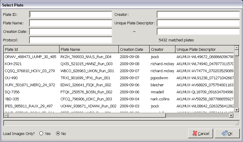 |
| Fig. A: A plate selector for Cellomics Store |
The plate selector in Fig. A lists all plates initially. As you enter more and more criteria, Panmo will automatically narrow the list of plates to match what you've entered. There is no need to press the Return or Enter key while entering criteria; the list of plates in the scroll area will be updated continuously as you type.
If you would like only the plate images, you can tell the system to load images only.