Scatterplots are the method of choice for displaying the distribution
of points in two dimensions.
They are used to discover patterns
such as holes, outliers, modes, and relations
between two variables.
A common problem is overstriking,
the overlap on the plotting surface of the glyphs
representing individual observations (or points).
Overstriking can create misleading impressions
of data distribution.
As a simple measure to cope with overstriking,
the default plotting glyph in
Panmo's scatterplots are unfilled circles. If there is only partial overlap and no exact overlap,
using an unfilledcircle as the plotting glyph can improve
the distinguishability of individual points. Filled circles do not share this property and can be
very misleading, as illustrated by the following plots.
 |  |  |
| Panel A | Panel B | Panel C |
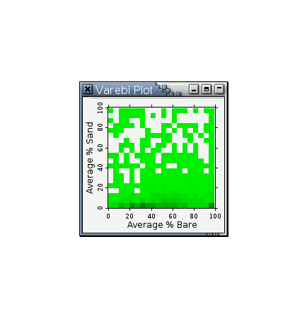
As a more sophisticated measure to cope with overstriking in scatterplots, the novel variable resolution bivariate plot (or Varebi plot for short) in Panmo deals with the problem of overstriking by mixing a display of a density estimate and display of individual observations. The idea is to determine the display format by analyzing the actual amount of overstriking on the screen. Thus, the display format will depend on the sample size, the distribution of the observations, the size and shape of individual icons, and the size of the window. It may change automatically when the window is resized. Varebi plots reveal detail wherever possible, and show the overall trend when displaying detail is not feasible.
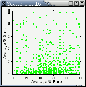
Here is an example comparing a scatterplot with a varebi plot (Data Credit: Professor P. Dee Boersma):
Here is an example of a varebi plot with different amount of drawing space (Data Credit: Professor P. Dee Boersma):
You'll have to make your web browser repeat the animation continuously to see these 2 plots properly. If there is no serious overstriking, the appearance of a varebi plot will approach that of a scatterplot as the drawing area increases.